About the project
Bonds Kids is a new concept store dedicated to newborns, babies and kids aged 3-7. An Australian household name, Bonds now offers a fresh, new, inviting retail environment; one that appeals to everyone. Just a bit whimsical, it captures the essence of the Bonds brand and brings it to life.
Why it works
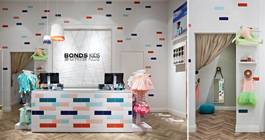
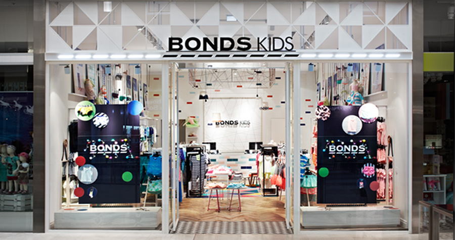
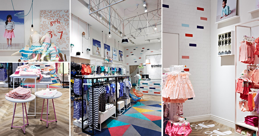
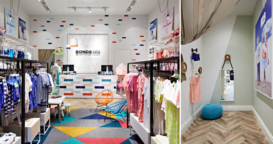
The new Bonds Kids design adds colour, pattern, a child-like influence, a touch of theatre and joy. It captures the essence of the Bonds concept and brings it to life by having a clean, white brick wall as a backdrop with some bright and fun colours that invite customers inside to explore. The colours were carefully selected to complement and reflect the colourful vibrancy of the brand and its range of product.
The store is really a textural backdrop with subtle changes in tactility defining different product stories, where the product is hero and the customer journey is carefully managed. There’s a dedicated kids’ café on a colourful geometric rug that is integral to the store design and important to make the kids feel at home, encouraging creativity and engaging the kids to play – allowing grownups more time to enjoy the shopping experience. Used sparingly and randomly against on the back wall of the store the colours draw attention and focus inside. Tactility in this design is key, here colour is used to tempt, indulge, excite and stimulate.
The oversized bold diagonal solid pattern in the fitting room follows the lines of yarn within the store and adds a little drama and magic for the little ones reflected in the mini-sized mirrors hanging on oversized button hooks. It adds to the slightly fairy-tale atmosphere but with a modern and unisex twist. Colour use here is simple yet dramatic, to make an otherwise small changing room space a conversation piece and a slightly quirky dynamic.
Insights
As Bonds soon reaches 100 years old, it was vital for the new concept design to bring the brand forward with a fresh, interactive environment. Translating the Bonds story from social media, print and virtual online presence to a rewarding physical in-store retail experience was crucial for the customer journey. Even with all the convenience of online shopping, people still love the physicality of exploring beautiful spaces where tactility, accessibility and effortlessness is key. Creating a 3D representation of the brand, inviting and engaging customers to feel the product up-close, stretch it, smell it and try it on, makes for an enjoyable shopping experience and a worthwhile brand investment. Oversized buttons, soft yarn and knitted feature details emphasise the link back to the basic thread of the products, their creation and ‘comfyness’. Customers leaving the store happier about Bonds than when they first walked inside, repeat customers and successful sales are a reflection of an effective store design.
Futher information
The Bonds Kids store design is one that activates exploration, tactility and accessibility, making the retail experience for this iconic brand standout and effortless at the same time. Initial sales have far exceeded brand expectations, and the Bonds brand moves forward.